How to use colour in film
How can colour tell a story?
Colour is an effect which can impact us psychologically, emotionally and even physically, mostly without us even knowing. Colour is used in films to create tension or harmony in a scene and also brings attention to key themes

Hue- the colour itself
Saturation- Intensity of the colour
Value- Darkness or lightness of a colour
The next few pictures are different colours which are supposed to affect us emotionally and what they make us feel-

Although colours are supposed the have meanings, they are not dogmatic. The colour must be defined in the film for the viewers reaction.
Balanced colour schemes
Single colours can have deep meanings, spread out palettes of colours(colour scheme) is more effective in describing the thematic context. They create a united tone. These are the four most common colour schemes.

Monochromatic
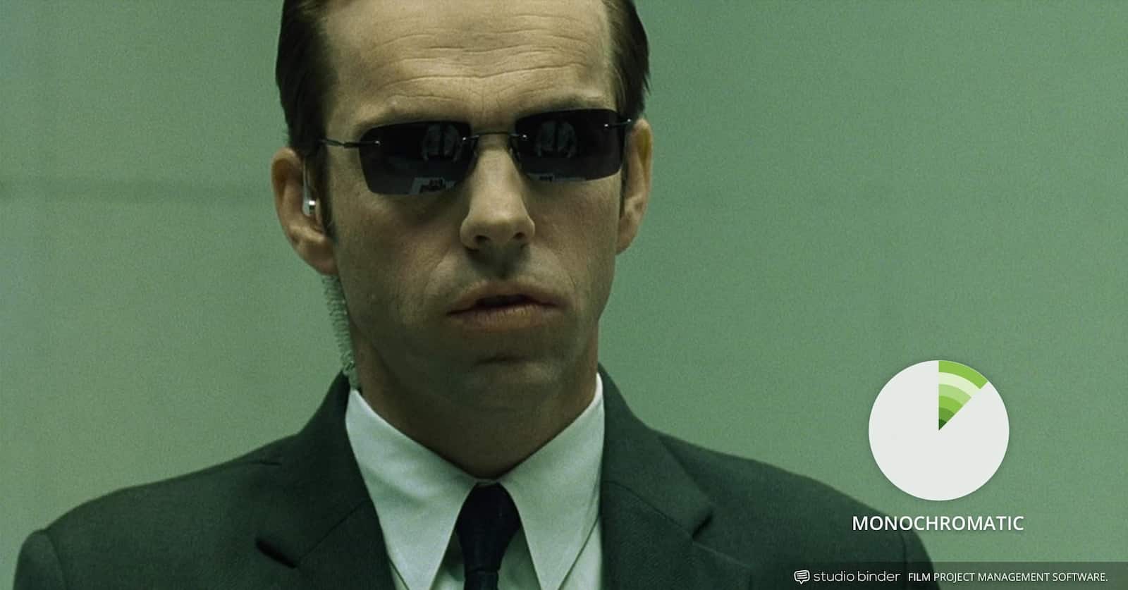
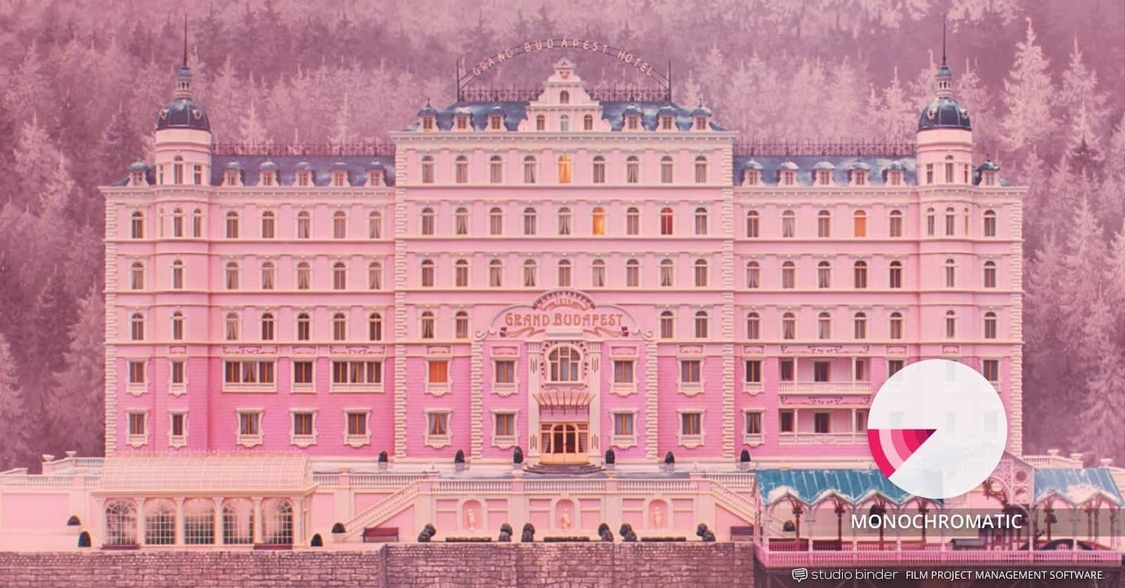
Monochromatic colour schemes come in shades of a single colour such as red, dark red and pink. They create the illusion of a peaceful feeling.
For example, The Matrix is a good example of a monochromatic movie colour scheme. Most scenes in the matrix have a green hue. This is to create an unnatural, lulling effect.
Complementary
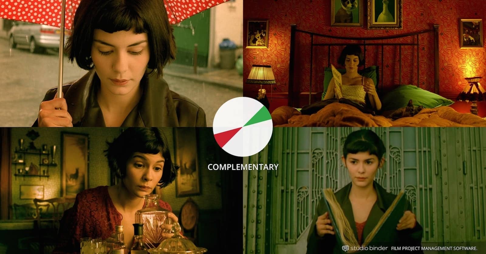
This is when colours are contrasting
For example, orange and blue are complementary colours often used in many films. They are commonly used for conflict.
Regardless of colour selection, complementary colours combine and always produce high contrast, and vibrant tension in the film.
Analogous
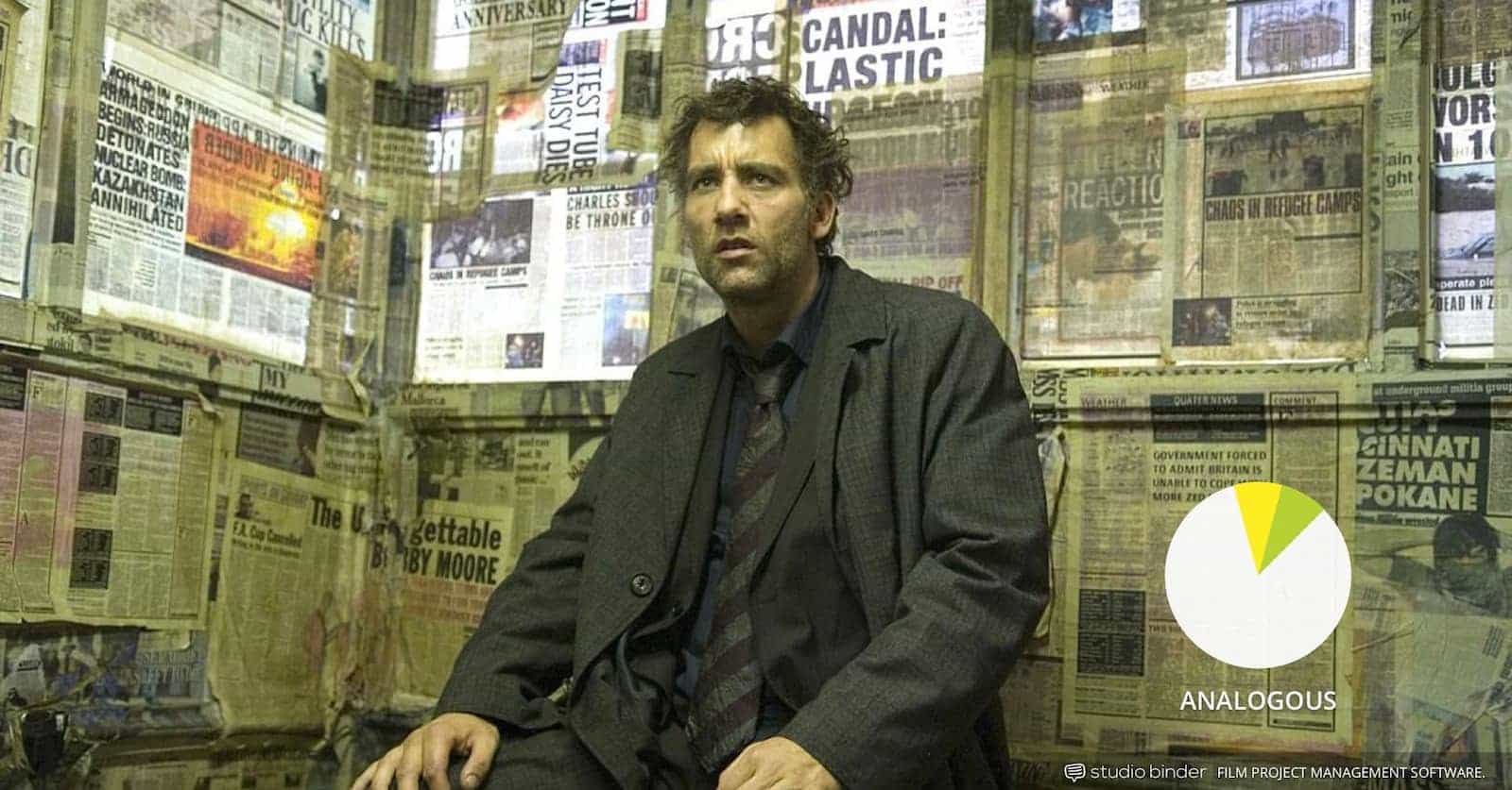
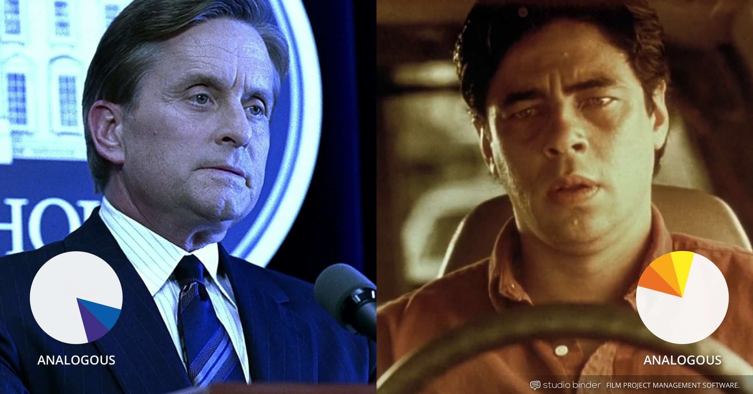
Analogous colours are colours which are next to each other on the colour wheel, for example, red/violet or yellow/lime green). As they don't have contrast or tension they make a harmonious and soothing picture. They are fairly easy to take advantage of in landscapes and exteriors and are commonly found in nature.
Triadic
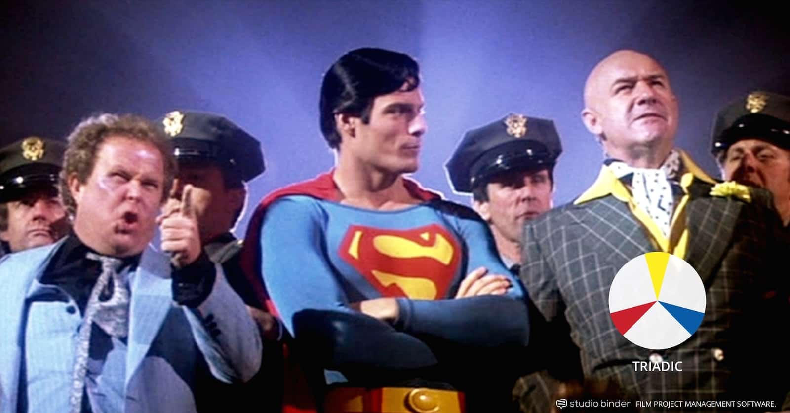
Triadic colours are colours that are vibrant and colourful, they are three colours arranged evenly around the colour wheel. With triadic colours, there should only be 1 dominant colour and the rest are accented, Triadic is one of the least common movie colour schemes.
Discordant colour schemes
This is the deliberate choice by the director to deviate from the balanced movie colour schemes. This is to refocus attention. Discording colours can help a character, detail, or a standout moment from the rest of the film.
Using transitional colours to indicate a change
When a recurring film palette or colour shifts over the course of the film it portrays a change in a character, story or themes. This is a powerful way to communicate a character or story in a visual manner.
Comments
Post a Comment